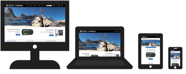
Hemos rediseñado nuestra Web, adaptada ahora a cualquier tipo de dispositvo
por Robin Deissinger | Actualizado: 12/16/2015 | Comentarios: 0

Have you found it somewhat difficult to navigate our website on a mobile device? Have you been a little bit frustrated by web pages that didn’t resize correctly to fit your device’s screen? To address these issues, our Web Development and Communications team has been busy working on a new design to provide you with a better experience. I invite you to explore our newly designed website using your favorite web-browsing device.
The Campbell Scientific website now has a responsive design that gives you a more optimized experience when you visit our site—whether you use a desktop or laptop computer, tablet, or smartphone. In this article, I’ll highlight some of the many updates.
Menu Bar
We streamlined the menu bar that appears at the top of all of the pages on our website. Depending on the screen size of the device you are using, you’ll see the menu displayed in one of two ways:
- A band with the options displayed across:

- A hamburger menu icon (on the far right) that expands when clicked or tapped:

Search Box
If the Search box in the top menu bar isn’t visible, click or tap the magnifying glass icon.
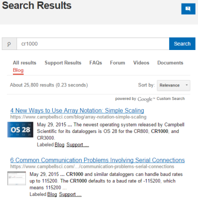
When you do a search, your search results are now grouped by type. You can choose to view all of the results together, or you can choose to only see results of a certain type, such as FAQs, documents, videos, forum postings, or blog articles. To use this functionality, just click or tap the type of results you would like displayed. The selected search-result type is displayed in red text and underlined.

Ask a Question Button
So that you can get help when you need it, we’ve added an Ask a Question button to most of our web pages. You’ll find it in the top-right corner. The button looks like either of these:
|
|
|
Just click or tap the button, complete the form, and click the Submit button. We respond to most of the inquiries we receive in one business day.
Product Pages
Our newly designed product pages may look a bit longer, and you may wonder how much scrolling you’ll have to do to find what you’re looking for. Don’t worry. We’ve added some tools to help you navigate the pages and quickly access the information that you need.
Navigating without Tabs
The individual product pages no longer use a tabbed format. So, where did all of that product information go? We have incorporated most of the information directly into the product information pages for the products. The exception is the ordering information.
- To access the ordering information for a product, click the blue Ordering Info button.
- To return to the product information page, simply click the blue Product Info button.
Depending on the type of device you’re using, these buttons will look a little bit different.
- The Ordering Info button looks like either of these:


- The Product Info button looks like either of these:


Menu Bar
If you’re using a larger screen, you’ll see a menu bar located near the top of the product information page. (On the product’s ordering information page, the menu bar is just below the product configuration options.) Click or tap one of the items in the menu bar, and you are automatically jumped down the page to that section.
For example, if you click the Documents link in this menu bar:
![]()
you are taken to that section on the page:

Quick Links
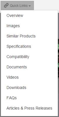
If you’re using a smaller screen, you’ll see the Quick Links menu on the left side. (If you’re using a larger screen, you won’t see the Quick Links menu until you’ve scrolled down the page a bit.)
![]()
Clicking or tapping the menu expands the list of options you can select from.

Back-to-Top Button
As you move down the page, you’ll notice that there is an arrow button in the bottom-right corner. If you click or tap that button, you are automatically jumped to the very top of the page. (You will see this arrow button on non-product pages as well.)
![]()
Support Page
We redesigned our Support page to provide you with a number of resources that you can easily access using one of three methods. Because each method works a little bit differently, one method may work better for you depending on what type of information you’re looking for.
#1 - Do a search
The Search Support Resources option works just like the Search box in the top menu bar, but it focuses solely on support content.

When you do a search, your search results are grouped by type. You can choose to view all of the results together, or you can choose to only see results of a certain type, such as FAQs, documents, videos, forum postings, or blog articles.
Tip: Use this option to search for a topic, such as “PakBus.”
#2 - Search by resource type
The Browse Support Resources option enables you to search only through a particular type of resource, such as documents.

Tip: Use this option to review an entire resource. For example, you might want to see which topics we have videos for.
#3 - Search for product-specific resources
The Find Resources by Product option categorizes all of the resources related to a particular product. In this example, I searched for “CR1000”:

If you click or tap the resource type (on the left) or its arrow (on the right), the list expands.
Tip: Use this option to find all of the resources for a particular product.
Browsing Forward
No matter what type of device you prefer to use, we hope that you find our website easy to navigate. Our goal is to help you quickly access the information that you’re looking for. If you do experience some difficulty finding something, please let us know. Click the Website Feedback link in the bottom-right corner of the web page.
![]()
The link opens a short form. Tell us how we can improve our website further. If you would like us to respond back to you directly, ensure that your email address is included in the Submitted by field before clicking or tapping the Send Feedback button.
Note: All of the example images in this article are taken from our US website. Our worldwide offices maintain their own websites that are similar to, but somewhat different from, the US website.


 Robin Deissinger is the Web Content Specialist at Campbell Scientific, Inc. She creates and maintains content on the company website, which is then shared across the global websites. She also manages the corporate social media program and occasionally contributes blog articles. Robin graduated from Bradley University with a bachelor's degree in communications with an emphasis in advertising, as well as a minor in psychology.
Comentarios
Please log in or register to comment.